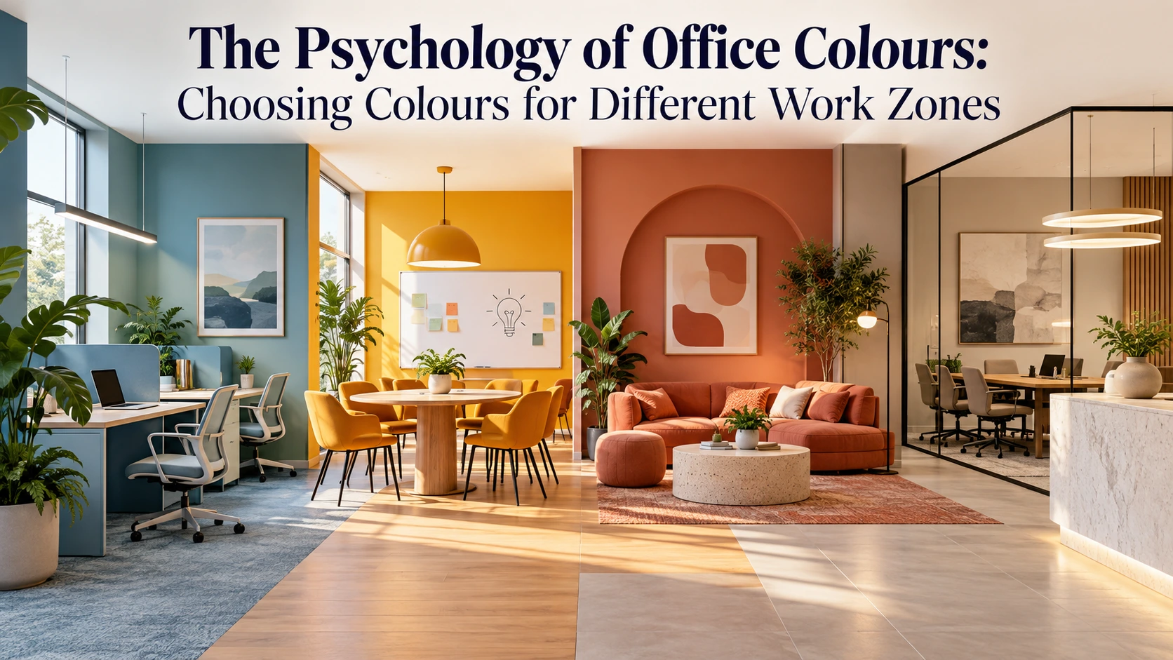

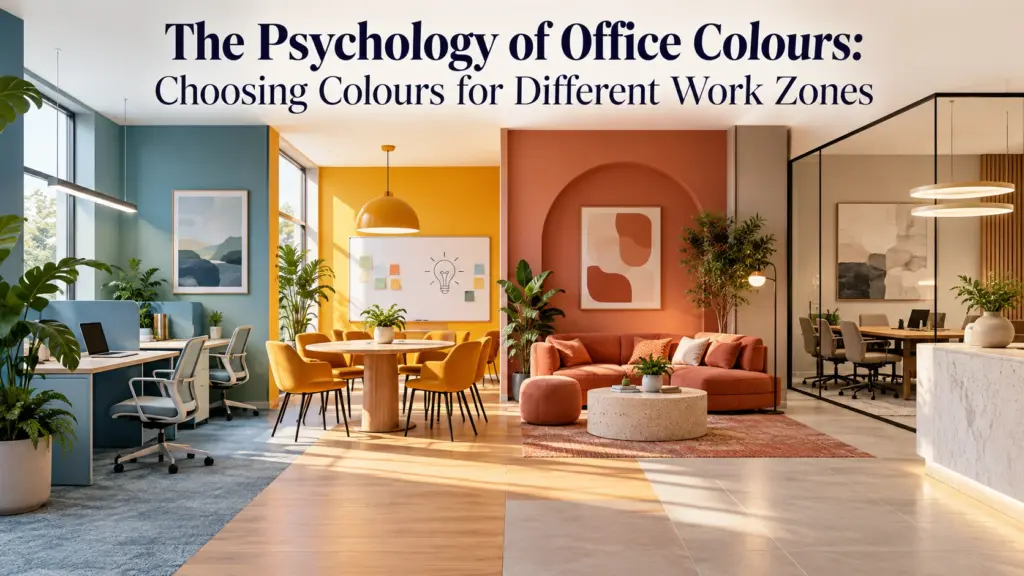
The Psychology of Office Colours: Choosing Colours for Different Work Zones
Office Colours can influence how a workplace feels and communicate a brand’s personality. However, colour psychology is not a simple formula where one colour guarantees productivity. Research has produced mixed findings, suggesting that hue, brightness, context, task type, and personal preference matter. Therefore, colour selection should support each work zone.
Read the research review on colour and psychological functioning
Why Office Colours Matter
Office Colours can influence comfort, mood, attention, and atmosphere. Studies have found differences in responses to red, blue, green, yellow, and neutral environments. Consequently, designers should treat colour as one part of a workplace strategy rather than a standalone productivity solution.
Read the workplace colour study on PubMed
Reception and Waiting Areas
For reception spaces, Office Colours should create a sense of identity and welcome. Soft neutrals, warm beige, muted green, or controlled brand colours can create a polished environment without overwhelming visitors. Moreover, accents can be introduced through furniture, upholstery, or lighting rather than covering every wall. Research on interior colour preferences also shows that colour choices can vary depending on whether people evaluate colours in isolation or within an architectural context.
Explore research on interior colour preferences and environmental context
Focus and Individual Work Zones
In focused work areas, Office Colours should remain comfortable and restrained. Blue and blue-green tones are often associated with calmer environments. A 2009 study by Ravi Mehta and Rui Juliet Zhu found that red enhanced performance on detail-oriented tasks, whereas blue enhanced performance on creative tasks. Thus, the work being performed should influence the palette.
Read the 2009 study in Science via PubMed
Meeting and Collaboration Zones
For meeting rooms, Office Colours can create energy without becoming distracting. Warm neutrals combined with accents of yellow, orange, or red can add visual interest. Nevertheless, strong saturated colours should be used thoughtfully because intense environments can become demanding. A balanced palette can make collaboration areas feel active while maintaining comfort. Research on workplace colour and mood suggests that saturation, brightness, and context can influence how an environment is experienced.
Read the research on colour, lightness and saturation
Creative and Brainstorming Areas
Creative zones can accommodate more expressive Office Colours than conventional workstations. Blue, yellow, or accent colours can introduce energy. A recent immersive virtual-reality workspace study involving 60 participants found higher positive-affect ratings in yellow and blue environments than in red and green environments, although the researchers noted that the results should be interpreted within the study’s experimental context. Therefore, these findings should guide experimentation rather than dictate a formula.
Read the recent workspace colour study on PubMed
Breakout and Recharge Spaces
Breakout areas can use Office Colours that feel softer and more relaxed. Muted greens, warm earth tones, dusty blues, and natural wood can create visual calm without making the space dull. Additionally, plants, daylight, textures, and comfortable furniture can work with the palette to establish a restorative atmosphere. Research into workplace environments suggests that light and colour should be considered together when creating spaces that support mood and comfort. Read the cross-cultural workplace study on light and colour
Cabins and Leadership Areas
For cabins or executive spaces, Office Colours can communicate authority, warmth, or sophistication. Deep green, navy, charcoal, taupe, and wood tones can create a grounded setting when balanced with sufficient light. However, darker colours can reduce openness, so they work best with lighter surfaces and lighting. Studies of interior colour preferences indicate that wall colours are often preferred lighter than colours considered for other objects or surfaces, making balance especially important in enclosed spaces.
Explore research on colour preference in interior environments
Read more: https://morphoraspaces.com/office-interior-design-in-60-days/
How Much Colour Is Too Much?
Using Office Colours effectively does not mean assigning a bright colour to every zone. Instead, establish a base palette and introduce accents according to function. A useful approach is a neutral foundation with one or two supporting colours, repeated through furniture or accessories. As a result, the workplace feels connected rather than fragmented. Research involving nearly 1,000 people across different work environments found that both light and colour contributed to workplace mood, while overly intense conditions could negatively affect the experience.
Read the large-scale workplace study on light and colour
Colour, Lighting, and Material Must Work Together
Office Colours never exist independently. The same paint can appear different under warm or cool lighting, beside wood or stone, or in rooms with different daylight levels. Furthermore, finishes can change intensity. Testing samples under actual lighting conditions is therefore essential before finalizing specifications. Research has shown that colour and lighting can interact to affect visual perception, attractiveness, brightness, and mood in workplace environments.
Read the study on colour and warm/cool workplace lighting
The Right Approach to Office Colours
There is no universal colour that automatically makes an office more productive. Office Colours should be selected according to the activity, desired atmosphere, natural light, brand identity, and preferences of the people using the space. Research supports the idea that colour influences workplace experiences, but findings remain context-dependent. Ultimately, thoughtful colour planning can make work zones feel purposeful, comfortable, and connected.